The Geography of Slavery
The deep divisions caused by the debate over slavery in 19th century America are etched into the political and economic maps of the era. The 1856 presidential campaign was dominated by the question of whether or not to repeal the Kansas-Nebraska Act of 1854, which had overturned the Missouri Compromise and allowed new states the option to permit slavery. The Democratic candidate, James Buchanan, supported the Act, while John C. Fremont, candidate for the newly formed Republican Party, opposed it. It was the prospect of the expansion of slavery into the West, even more than its presence in the South, which worried those fighting to contain or abolish slavery.
The John Jay and Reynold’s maps shown here, and numerous variations of them, were a centerpiece of Fremont’s campaign literature, appearing in posters, handbills, pamphlets and the candidate's official campaign biography. Not only did these maps employ different tones and color to divide the country into two categories—freedom and slavery—but they also emphasized the areas “at risk” by slightly tilting the top of the maps away from the viewer, foreshortening the size of the Northern free states and enlarging those in the South.
The “Map Showing the Distribution of the Slave Population of the Southern States” from 1861 reveals a more complex geography. Its use of graduated shading to indicate the density of enslaved populations in each county of the Southern states revealed that dependence on slavery was not uniform across the Confederacy. President Lincoln was captivated by this map and kept it close at hand. It helped reinforce his belief that secession was not about states’ rights, but about defending slavery, and helped convince him that liberating as many enslaved people as possible would destabilize the Southern economy. This map also helped him assess geographic variations in Confederate sentiment, which in turn shaped Union military strategy.
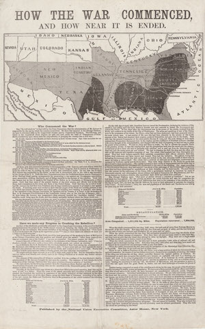
National Union Executive Committee (U.S.). How the War Commenced and How Near It Is Ended. 1864.
On loan from the Collection of PJ Mode.
During the 1864 Presidential campaign, the ”Copperheads“ (Northern Democrats opposed to the Civil War) formed a new political party and nominated John Fremont as their candidate. In response, the Republicans rebranded themselves as the ”National Union Party“ in order to attract the support of Northern War Democrats. Responding to Copperhead attacks on Lincoln, the National Union Executive Committee published this broadside and map showing the Union’s progress in fighting the war, and concluding that: ”The end cannot be doubtful. They who violated the Divine Law have incurred the penalty, and will inevitably meet the allotted punishment. They who took the sword are perishing by the sword.”
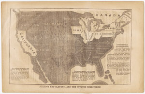
John Jay. “Freedom and Slavery, and the Coveted Territories.” Back cover: John C. Fremont Campaign. Life of John Charles Fremont. New York: Greeley & McElrath, 1856.
Gift of PJ Mode.
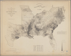
Edwin Hergesheimer. Map Showing the Distribution of the Slave Population of the Southern States of the United States, Compiled from the Census of 1860. Henry S. Graham, 1861.
Olin Library Maps, G3861.E9 1861 .U5.
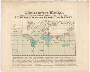
James Cropper. Chart of the World on Mercator’s Projection: Illustrative of the Impolicy of Slavery. J. Cross, 1823.
On loan from the Collection of PJ Mode.
The author of this map, James Cropper, was a wealthy Quaker merchant and philanthropist who was active in the anti-slavery movement. As a disciple of the economist Adam Smith, he believed that eliminating tariff protections would lead to the end of slave labor in the West Indies. Hence he created this map to promote that perspective, showing how import prohibitions and high duties on sugar were artificially inflating prices and inhibiting manufacturing in England.
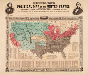
William C. Reynolds. Reynolds’s Political Map of the United States. 1856.
On loan from the Collection of PJ Mode.
This landmark map supporting the candidacy of John Fremont played an important role in the 1856 Presidential election. It dramatically sets out the stakes involved in the potential spread of slavery to the Western states with a number of techniques commonly found in persuasive cartography. The color of the western territories differs dramatically from the pink of the free states, giving the impression that slavery has already (or nearly) arrived in the West. The text on the map describes the existing unfairness of congressional representation and postal expenditures, both favoring the slave states. And the map is not based on the familiar Mercator projection. As a result, the relative size of the northern states is reduced and that of the southern states is increased, as if the globe is being viewed from above the southern states, foreshortening the northern ones.