Navigating Disaster
Some persuasive maps use shock value to provoke outrage, alarm, or fear. The manipulation of spatial relationships or the use of stark graphics can magnify a sense of impending loss or danger. These maps demand attention, or that actions be taken.
In 1889, William Temple Hornaday, the Chief Taxidermist for the Smithsonian Museum, traveled west to collect specimens. He was alarmed by what he saw and learned about the extermination of the bison. Although his massive report was filled with detailed observations and data, it was his map that communicated the rapid loss most effectively. The dark red circle shows the “area once inhabited by the American Bison,” with accompanying dates documenting the extinction in each locale. Blue circles show the range of the herds in 1870, while the much smaller concentric green circles highlight the few small bands that remained in 1889—the largest of these was a herd of 200 found within the country’s first national park at Yellowstone.
Exposing the dark side of Manifest Destiny and western expansion, Hornaday’s map documents not just the decline of the bison, but also the parallel destruction of the Native American tribes of the Great Plains. One year later, the Wounded Knee Massacre on the Pine Ridge Reservation in South Dakota ended a traditional way of life forever.
Today’s increasing awareness of climate change and other man-made threats to the health of the planet is also expressed through persuasive maps and data. Ominous forebodings appear in our weather maps and the prevailing winds. Might whole cities disappear in a nuclear cloud or under the rising seas? Projections and predictions seek to stir controversy, debate, and action.
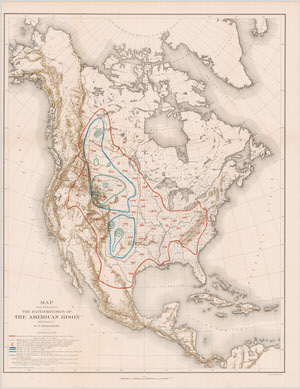
William Temple Hornaday. “Extermination of the North American Bison With a Sketch of Its Discovery and Life History.” In: Report of the National Museum Under the Direction of the Smithsonian Institution, 1887. Washington: Government Printing Office, 1889.
Gift of PJ Mode.
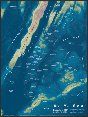
Jeffrey Linn. N. Y. Sea. January 6, 2015.
On loan from the Collection of PJ Mode.
This map of New York City shows the approximate new sea levels that would result—a rise of 100 feet—if half of the world’s ice sheets melted.
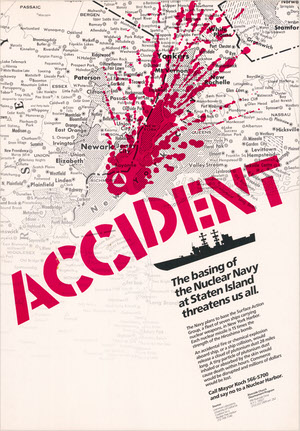
Riverside Church Disarmament Program. Accident: The Basing of the Nuclear Navy at Staten Island Threatens Us All. 1984.
On loan from the Collection of PJ Mode.
In July 1983, the United States government proposed the establishment of a homeport for a group of Navy warships on Staten Island. Though local political and business leaders supported the move, citing potential economic benefits for the borough, environmental groups throughout the New York-New Jersey metropolitan area opposed it. This poster, issued by the Riverside Church Disarmament Program, warns of the potential dangers of nuclear fallout to the region.
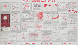
William Bunge. Nuclear War Atlas. Blackwell, 1988.
On loan from the Collection of PJ Mode.
The Nuclear War Atlas explores the threats of nuclear war at the policy, state, and personal level. Bunge was a quantitative geographer and spatial theorist who became an anti-war activist.
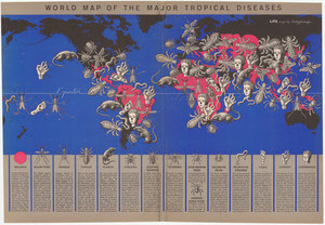
Boris Artzybasheff. World Map of the Major Tropical Diseases. 1944.
Gift of PJ Mode.
Boris Artzybasheff was a well-known American illustrator of Russian descent. He created this world map to accompany an article on tropical diseases. The use of ominous pictorial symbols for 15 different diseases, shown at various sizes and locations, effectively communicate the danger and urgency of the problem.