13th Century
![]()
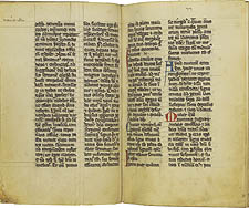
In this example the characteristics of Gothic minuscule are fully developed,
including angular serifs, forked stems (see especially the letters b,
h, and l), the preference for the letter d with
a stem angled to the left rather than a vertical stem, and the use of
a 7-like sign to indicate an ampersand. Scribes held the pen at an angle
of about 45° in order to exploit the shading (that is, the variation
in thickness of a penstroke) offered by a quill nib. Another characteristic
of Gothic manuscripts is the abundant use of abbreviations, which enabled
scribes to copy texts faster and to save parchment. Gothic manuscripts
also tend to display prominent ruling drawn in lead or brownish "crayon."
In contrast, the examples of Caroline and Protogothic minuscule have nearly-invisible
ruling achieved with a stylus, a sharp implement used to scratch grooves
into the parchment. On the whole, Gothic minuscule looks bolder, denser,
and more elaborate than the scripts that preceded it. This distinct Gothic
script was not, however, the result of a deliberate break with the past;
it represents the cumulative effect of slight changes that emerged one
by one over the course of centuries.
![]()
The Life of St. Francis. Germany, ca. 1300.
![]()

Copyright
© 2002 Division of Rare & Manuscript
Collections
2B Carl A. Kroch Library, Cornell University, Ithaca, NY, 14853
Phone Number: (607) 255-3530. Fax Number: (607) 255-9524
For
reference questions, send mail to:
rareref@cornell.edu
If you have questions or comments about the site, send mail to: webmaster.